Professional brochures remain one of the most effective marketing tools for UK businesses, offering tangible brand representation that digital marketing simply cannot match. When designed and printed correctly, brochures can increase brand recall by up to 70% and drive measurable business results. This comprehensive guide will walk you through creating brochures that captivate, inform, and convert.
Understanding Your Brochure's Purpose
Before touching design software, clearly define your brochure's primary objective. Are you introducing a new service, showcasing your company's capabilities, or driving attendance to an event? This purpose will guide every design decision and content choice.
Different brochure types serve different purposes. Tri-fold brochures work excellently for service overviews and company introductions. Bi-fold brochures provide more space for detailed information and are perfect for product catalogues. Z-fold brochures create engaging, step-by-step narratives ideal for process explanations or customer journeys.
Consider your distribution method during planning. Will these be handed out at networking events, displayed in reception areas, or mailed to prospects? Each distribution method influences optimal size, paper weight, and design approach.
How to Research Your Target Audience
Step 1: Define Your Ideal Customer
Create detailed buyer personas including demographics, pain points, and communication preferences. Isle of Sheppey businesses often serve both local and regional customers, requiring different messaging approaches.
Step 2: Analyse Competitor Materials
Study successful brochures in your industry. What design elements work well? How do they structure information? This research provides valuable insights whilst helping you identify differentiation opportunities.
Step 3: Consider Reading Habits
UK consumers typically scan brochures following a Z-pattern—top-left to top-right, diagonally to bottom-left, then across to bottom-right. Structure your content to align with these natural reading patterns.
How to Structure Compelling Content
Start with attention-grabbing headlines that immediately communicate value. Your headline should answer the reader's unspoken question: "What's in this for me?" Use active voice and specific benefits rather than vague promises.
Organise information hierarchically. Lead with your most important message, followed by supporting details. Use subheadings to break up text and guide readers through your content. Each section should build upon the previous one, creating a logical flow towards your call-to-action.
Benefits always outweigh features. Instead of listing what your service includes, explain how it improves customers' lives or businesses. For example, rather than "24-hour customer support," use "peace of mind with round-the-clock assistance whenever you need it."
Design Principles for Maximum Impact
White space is your most powerful design tool. Generous white space around text and images creates visual breathing room, making information easier to digest. Cramped designs appear unprofessional and overwhelming, regardless of content quality.
Maintain consistent brand identity throughout. Use your established colour palette, fonts, and imagery style. This consistency reinforces brand recognition and builds trust. If you haven't established brand guidelines, your brochure project provides an excellent opportunity to develop them.
Typography hierarchy guides reader attention. Use larger fonts for headlines, medium sizes for subheadings, and smaller fonts for body text. Limit yourself to two font families maximum—one for headlines and another for body text. This restraint creates cohesion and readability.
How to Select Appropriate Images
High-quality images dramatically impact brochure effectiveness. Blurry, pixelated, or amateur photos undermine professional credibility. Invest in professional photography or high-resolution stock images that align with your brand aesthetic.
Images should support your message, not distract from it. Every image should serve a purpose—illustrating a service, showcasing results, or creating emotional connections. Decorative images without clear purpose waste valuable space and dilute your message.
Consider your audience's cultural context. Images that resonate with urban London audiences may not connect with rural Isle of Sheppey customers. Local imagery often creates stronger emotional connections and demonstrates community understanding.
Colour Psychology and Brand Consistency
Colours influence emotions and perceptions. Blue conveys trust and professionalism, making it popular for financial and healthcare services. Green suggests growth and environmental consciousness, whilst red creates urgency and excitement. Choose colours that align with your brand personality and audience expectations.
Maintain sufficient contrast between text and background colours. Poor contrast reduces readability and creates accessibility issues. Test your colour combinations by printing samples or viewing them on different devices to ensure consistent appearance.
Consider printing costs when selecting colours. Full-colour printing (CMYK) offers maximum flexibility but costs more than spot colour printing. If budget constraints exist, strategic use of one or two spot colours can create striking designs whilst controlling costs.
How to Write Compelling Copy
Write conversationally, as if speaking directly to one person. This approach creates connection and engagement. Avoid jargon unless your audience expects technical language. When technical terms are necessary, provide clear explanations.
Use active voice to create energy and clarity. "We provide excellent customer service" sounds more confident than "Excellent customer service is provided by us." Active voice also requires fewer words, creating more space for other important information.
Include social proof wherever possible. Customer testimonials, case studies, and industry awards build credibility and trust. UK consumers particularly value peer recommendations, making testimonials from local customers especially powerful.
Paper Selection and Printing Considerations
Paper weight affects perceived quality and durability. 170gsm provides good quality for most applications, whilst 250gsm creates premium feel for upmarket businesses. Consider your budget and intended use when selecting paper weight.
Finish options impact both appearance and functionality. Matt finish offers sophisticated appearance with excellent readability. Gloss finish provides vibrant colours but can reflect light and show fingerprints. Silk finish balances these characteristics, offering subtle sheen with good readability.
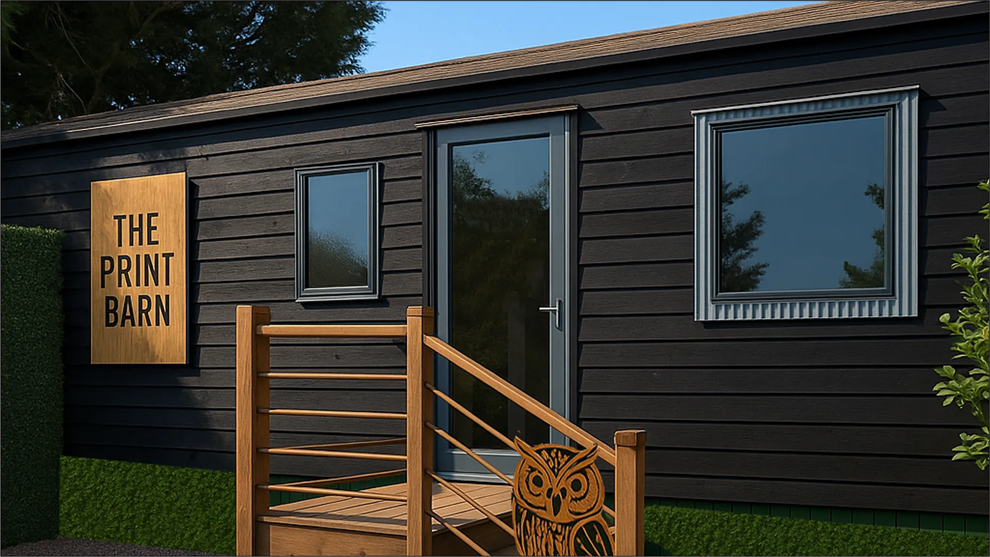
Sustainable paper options increasingly appeal to environmentally conscious consumers. FSC-certified papers demonstrate environmental responsibility whilst maintaining professional appearance. At The Print Barn, we offer extensive sustainable options that don't compromise on quality.
Distribution Strategy and Measurement
Plan distribution channels during design phase. Reception area displays require different sizing than trade show handouts. Direct mail pieces need different paper weights than door-to-door distribution materials.
Track effectiveness through unique contact methods. Dedicated phone numbers, specific website landing pages, or unique discount codes help measure brochure impact. This data guides future design and distribution decisions.
Consider seasonal timing for maximum impact. Tourist-focused Isle of Sheppey businesses should time distribution for peak season, whilst B2B services might focus on beginning of financial years when budgets are allocated.
Quality Control and Professional Printing
Always review physical proofs before final printing. Screen colours differ from printed results, and layout issues may not be apparent until printed. Professional printing services like The Print Barn provide proof options to ensure satisfaction.
Verify all contact information, pricing, and factual claims. Errors in printed materials are costly to correct and damage professional credibility. Have multiple people review content before approving final production.
Plan sufficient lead time for quality results. Rush jobs often compromise quality and increase costs. Professional printing requires time for proper setup, colour matching, and quality control processes.
Professional brochures represent significant opportunities for business growth when executed correctly. By following these guidelines and partnering with experienced printing professionals, you'll create marketing materials that engage audiences, build brand credibility, and drive measurable results.

What our lovely customers say...
We add that personal touch to each and every order
Lorem ipsum dolor sit amet, consectetur adipiscing elit. Donec eu ante vel massa blandit lobortis. Phasellus elit nibh, condimentum egestas mi vel, ullamcorper malesuada mauris
Lorem ipsum dolor sit amet, consectetur adipiscing elit. Donec eu ante vel massa blandit lobortis. Phasellus elit nibh, condimentum egestas mi vel, ullamcorper malesuada mauris
Lorem ipsum dolor sit amet, consectetur adipiscing elit. Donec eu ante vel massa blandit lobortis. Phasellus elit nibh, condimentum egestas mi vel, ullamcorper malesuada mauris
Lorem ipsum dolor sit amet, consectetur adipiscing elit. Donec eu ante vel massa blandit lobortis. Phasellus elit nibh, condimentum egestas mi vel, ullamcorper malesuada mauris
Lorem ipsum dolor sit amet, consectetur adipiscing elit. Donec eu ante vel massa blandit lobortis. Phasellus elit nibh, condimentum egestas mi vel, ullamcorper malesuada mauris
Lorem ipsum dolor sit amet, consectetur adipiscing elit. Donec eu ante vel massa blandit lobortis. Phasellus elit nibh, condimentum egestas mi vel, ullamcorper malesuada mauris
Why Choose The Print Barn for Your Needs
At The Print Barn, we pride ourselves on our fast turnaround times, ensuring you receive your custom garments when you need them. With no minimum order requirements, we cater to both small and large requests, making it easy for everyone to access high-quality printed and embroidered items. As a UK-based company, we offer friendly support and a personal touch to every order.